Overview
Briandari Foods is a food production brand centered around quality grains and wholesome ingredients. The project involved creating a cohesive visual identity that signals freshness, warmth, and culinary reliability.
The Problem / Goal
The goal was to build a recognizable brand identity that stands out in the food and beverage sector. The visual language needed to feel established and trustworthy while maintaining a warm, inviting appeal that suggests “fresh from the oven” quality.
The Solution
I designed a comforting and professional brand system anchored by a distinct wordmark and wheat iconography.
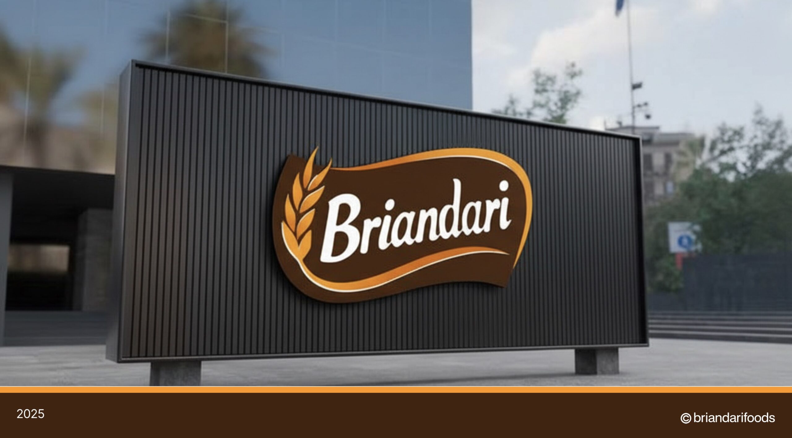
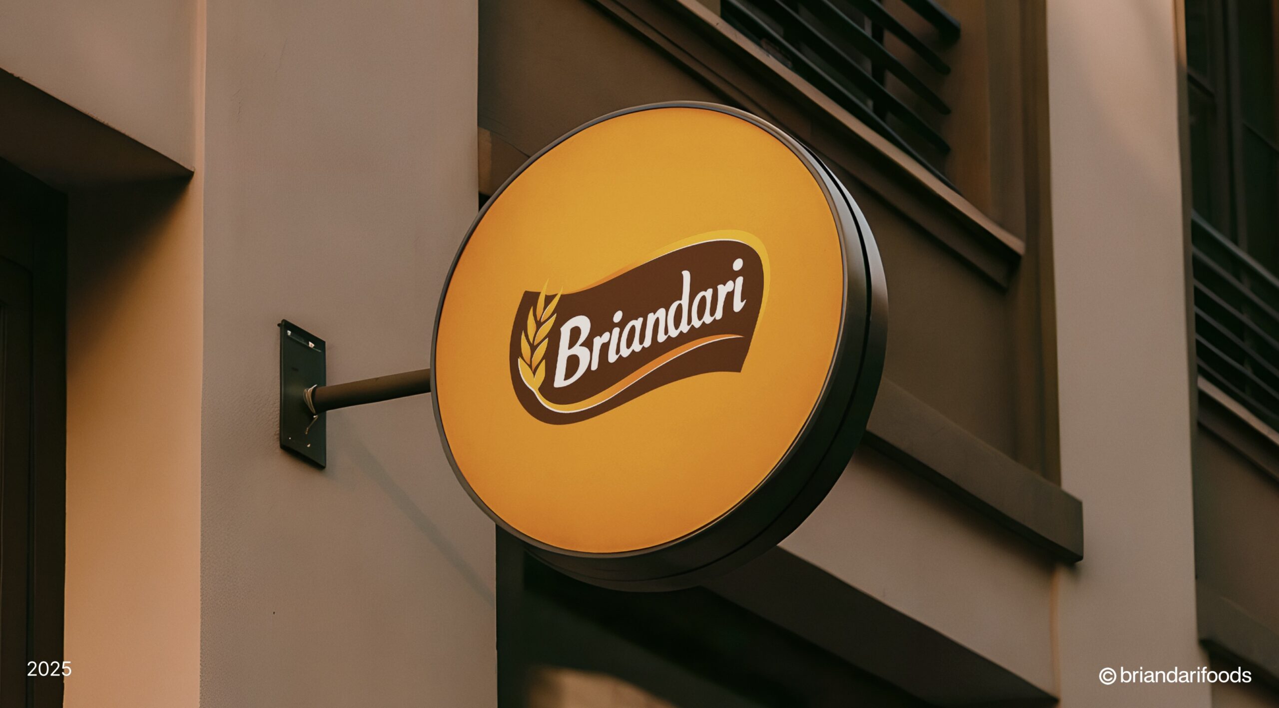
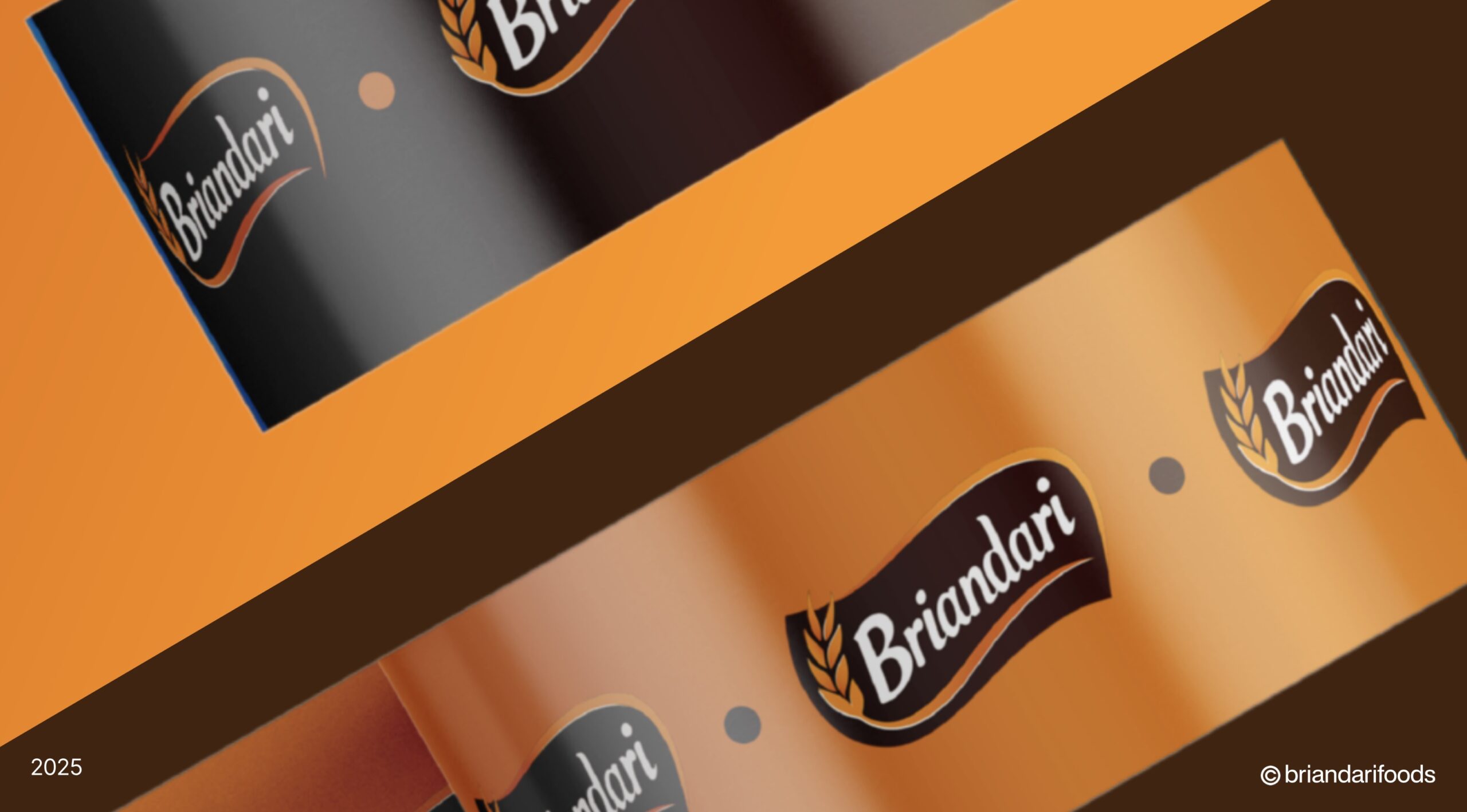
Logo Design: Created a dynamic logo featuring a stylized wheat stalk and a sweeping “swoosh” container, symbolizing movement, freshness, and natural ingredients.
Typography: Used a soft, rounded script font for “Briandari” to evoke a friendly and handcrafted feel, contrasting with the bold shape behind it.
Color Palette: Employed a rich, appetizing palette of Chocolate Brown and Golden Wheat/Orange, triggering associations with baking, earthiness, and warmth.
Brand Pattern: Developed a large-scale wheat stalk graphic used as a subtle watermark on tote bags and ID cards to reinforce the brand’s core ingredient focus.
My Role
Brand Identity Design: Designed the primary logo and established the color theory.
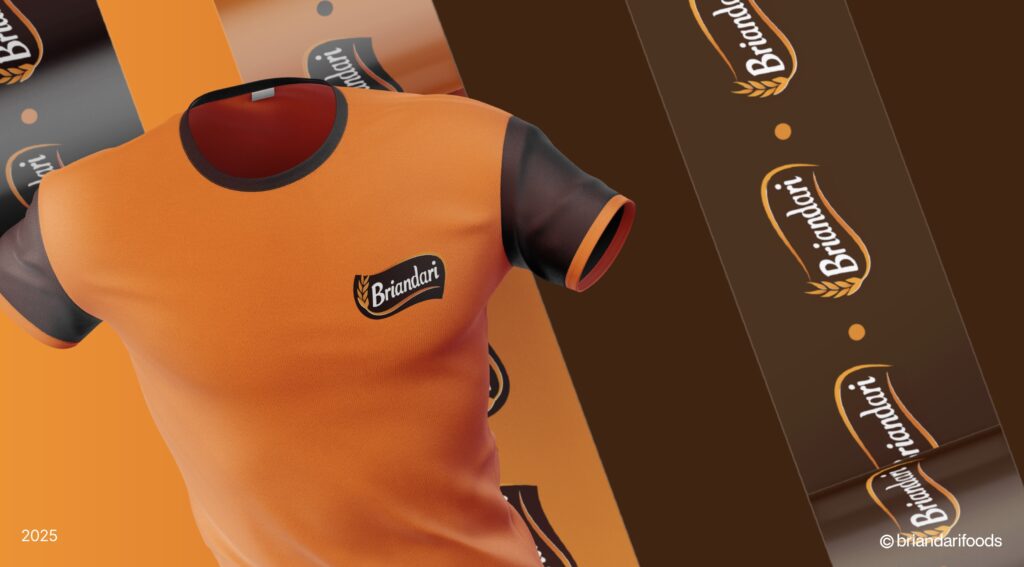
Merchandise & Apparel: created functional branded assets including chef aprons, staff polo shirts, and lanyards.
Corporate Collateral: Designed business cards, outdoor signage, and packaging materials to ensure a consistent brand experience from factory to front desk.