Overview
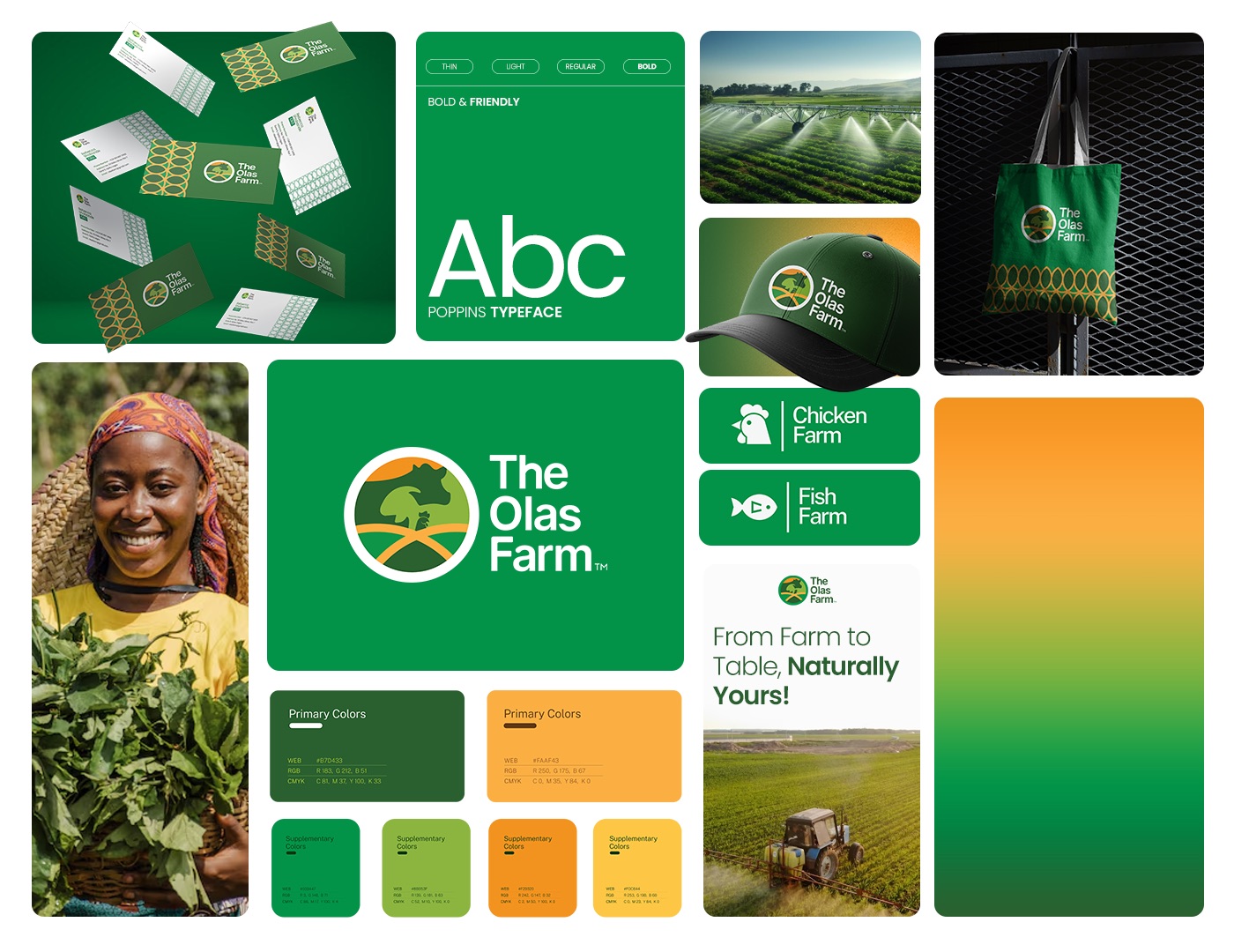
The Olas Farm is a comprehensive agricultural brand focused on “Exceptional Farming for Massive Harvest”. The identity system covers a diverse range of agricultural activities, from poultry and livestock to crop cultivation, emphasizing a “Pasture to Plate” philosophy.
The Problem / Goal
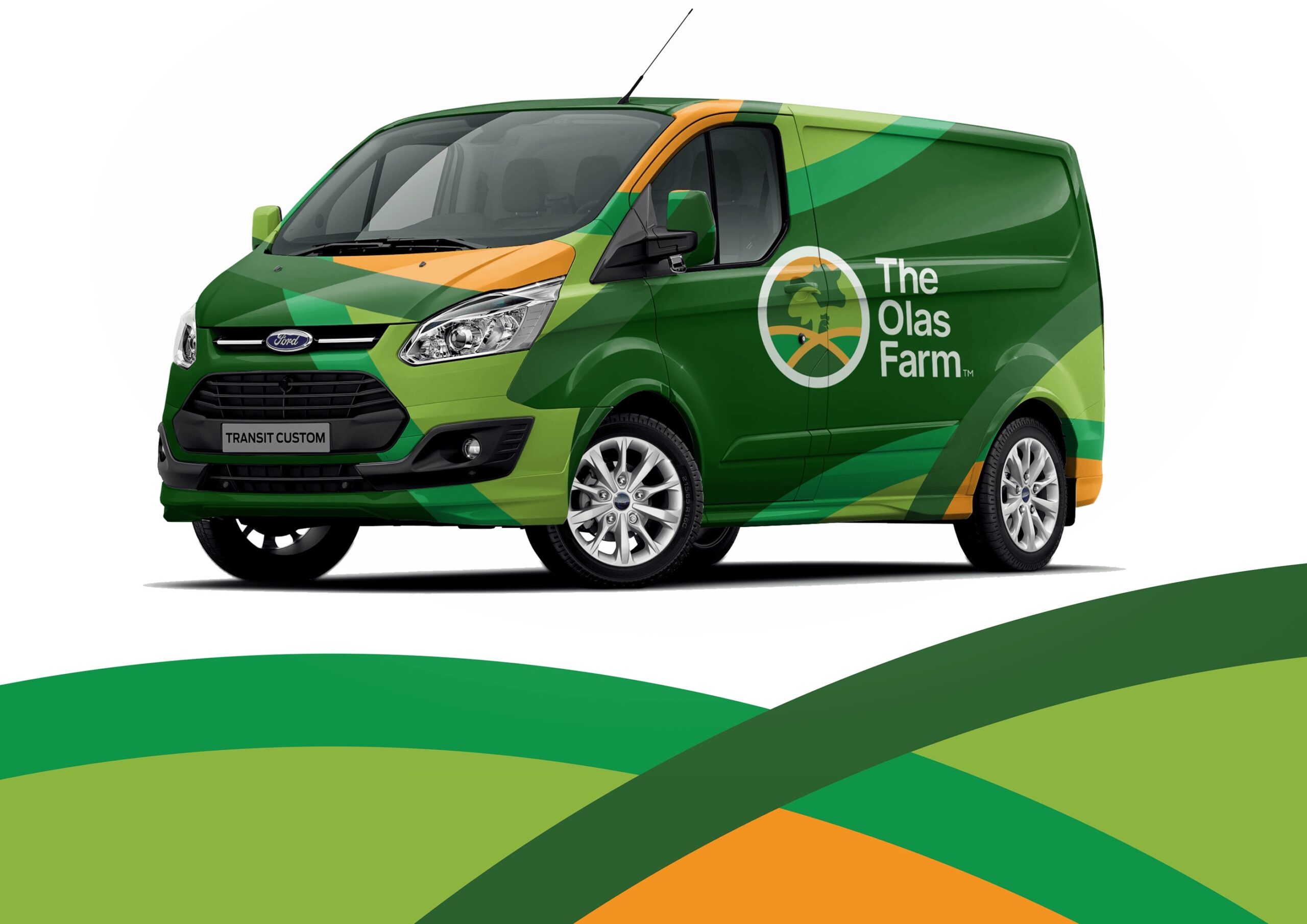
The objective was to create a scalable and versatile visual identity that works across various physical and digital touchpoints. The branding needed to communicate reliability, freshness, and community-supported agriculture while maintaining a professional corporate look suitable for uniforms, vehicle branding, and stationary.
The Solution
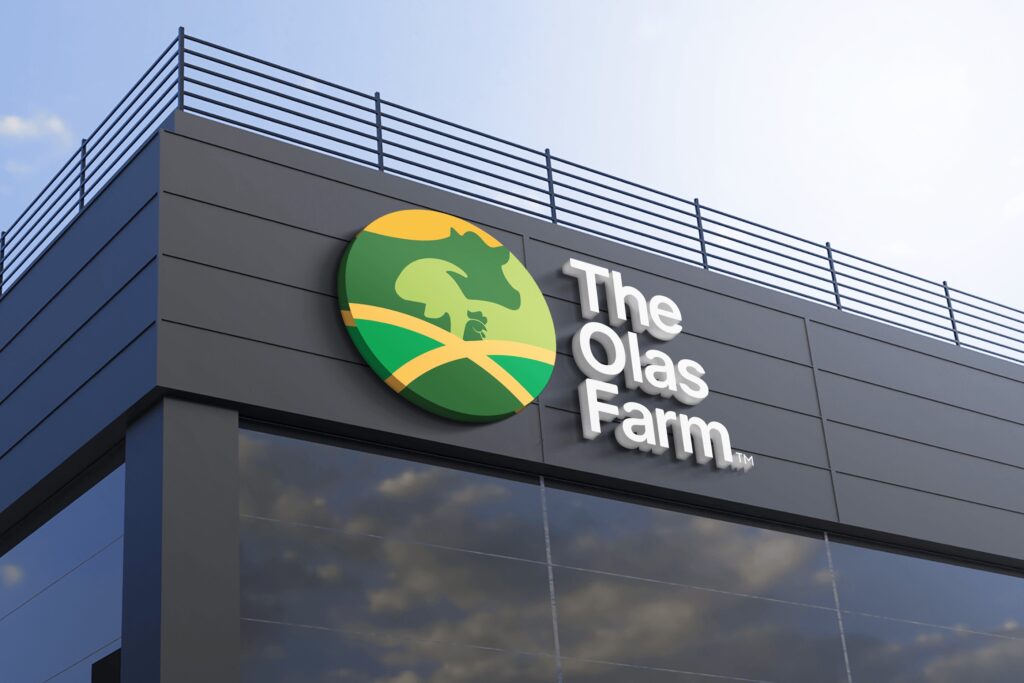
I designed a modern, circular brand mark that integrates livestock and crop symbols, paired with a vibrant, nature-inspired color system.
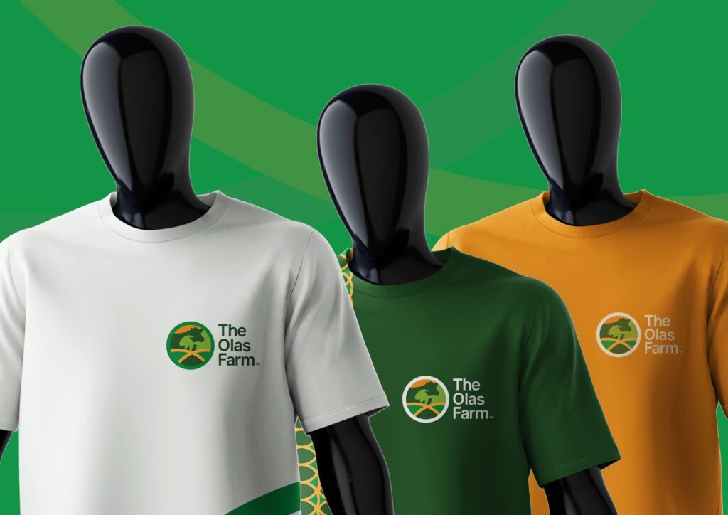
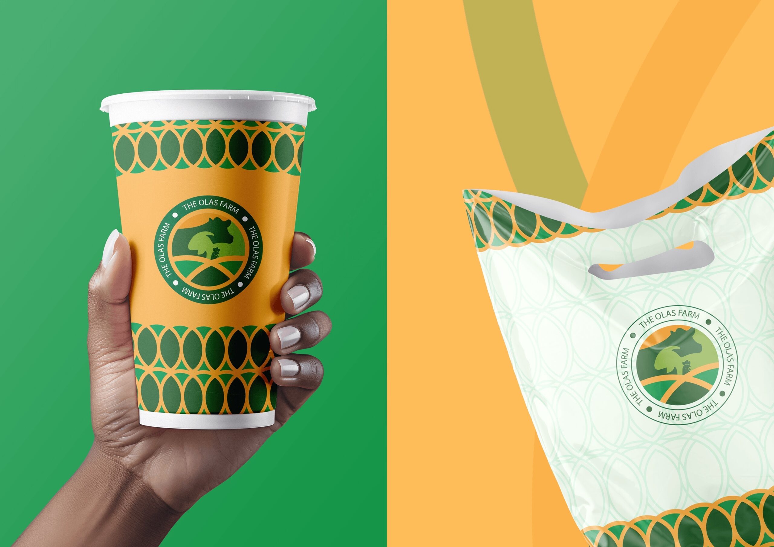
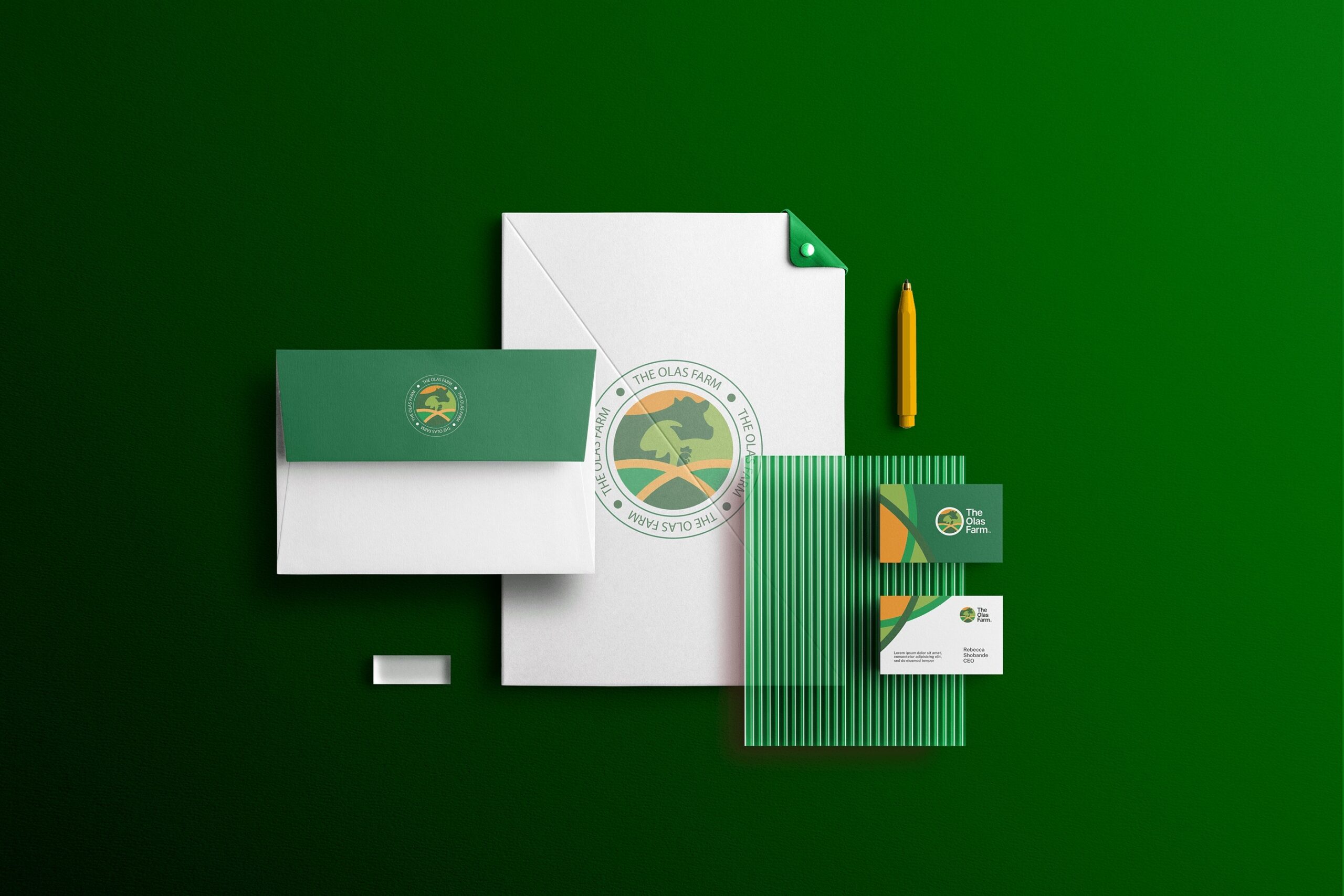
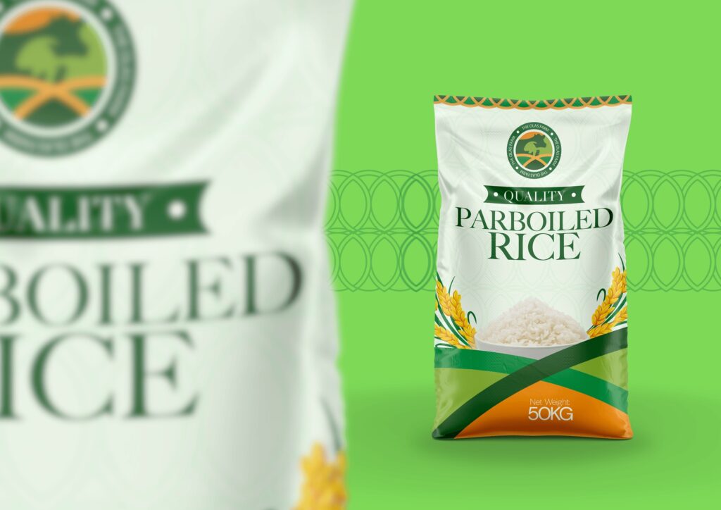
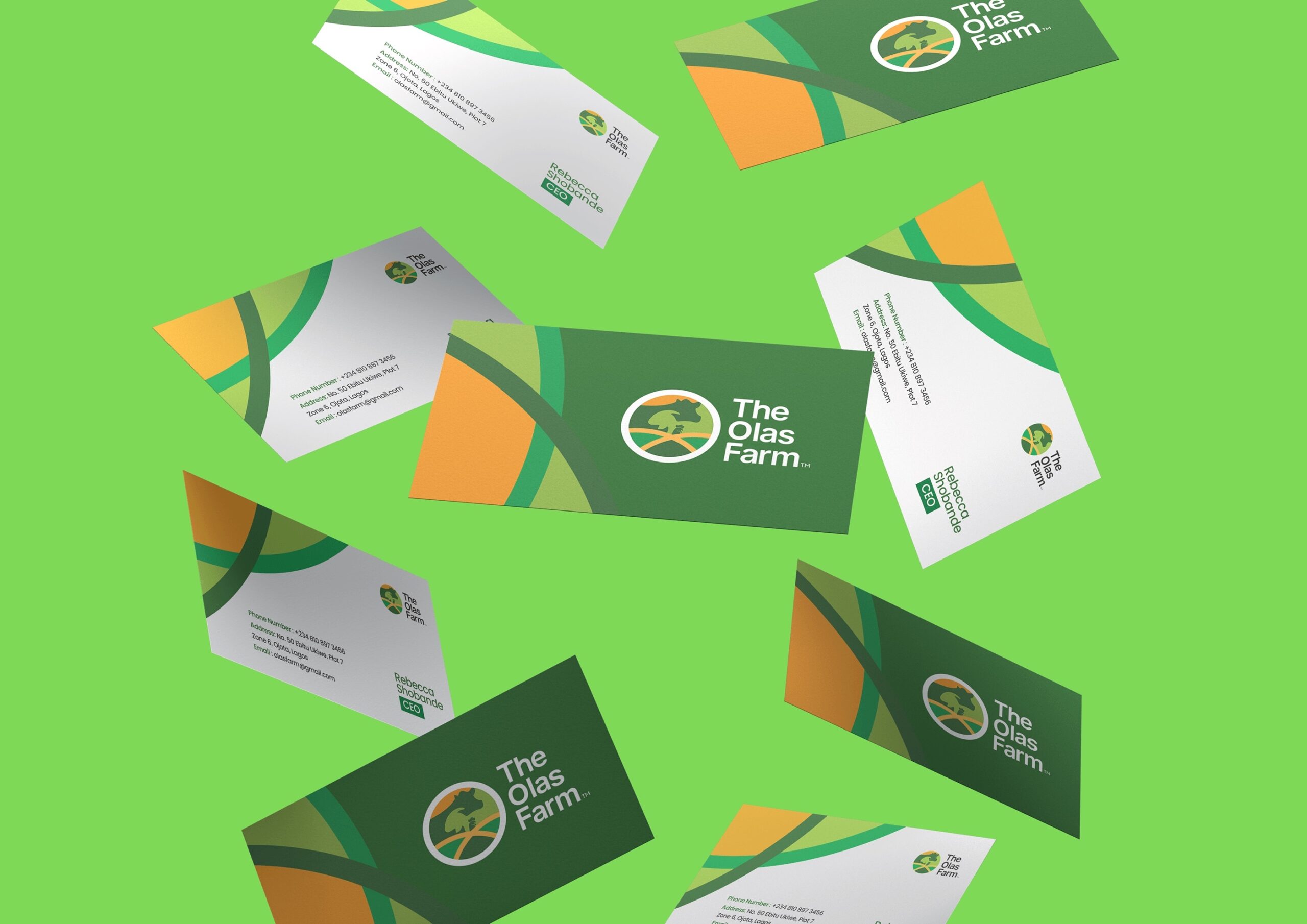
Logo Variations: Developed a flexible system including a primary vertical logo, a secondary horizontal layout, a standalone icon (logomark), and a badge/crest specifically for packaging and branded materials.
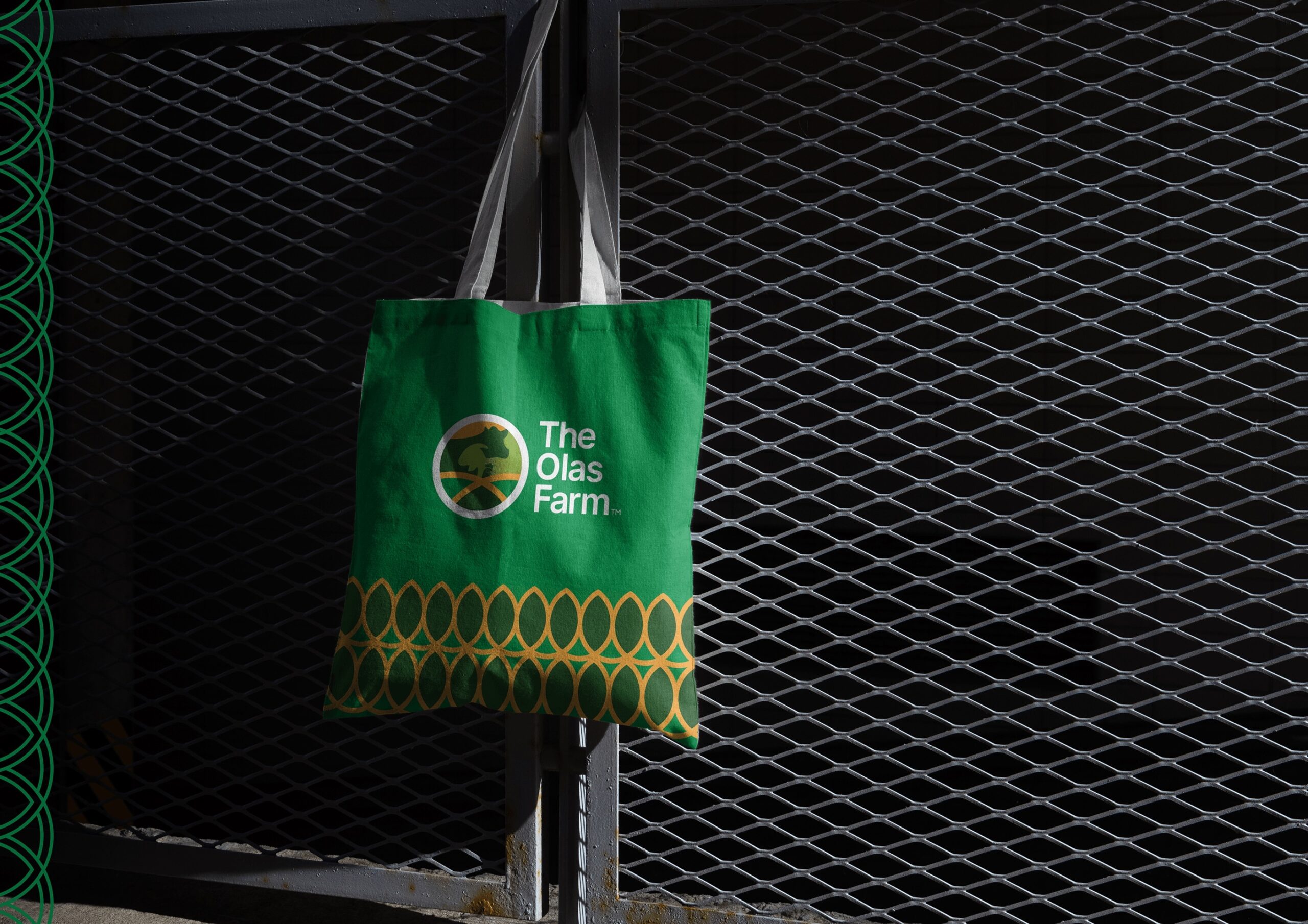
Visual Language: Created a repeating oval pattern that serves as a brand texture for notebooks, lanyards, and shopping bags, reinforcing brand recognition without needing the logo present at all times.
Color Strategy: A palette of Forest Green, Leaf Green, and Harvest Orange to symbolize growth, vitality, and the literal harvest.
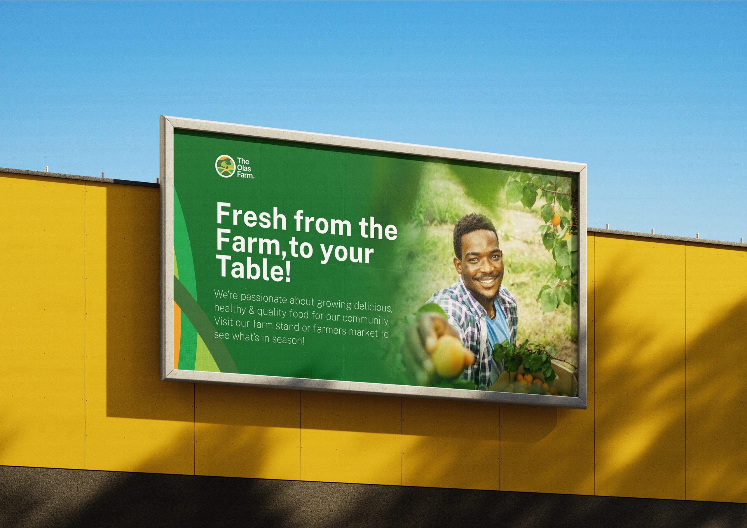
Brand Voice & Messaging: Integrated strong, benefit-driven taglines such as “Strong Roots, Stronger Community!” to foster a connection with the local customer base.
My Role
Brand Identity & Systems Design: Crafted the full logo suite and developed the supporting pattern and visual language.
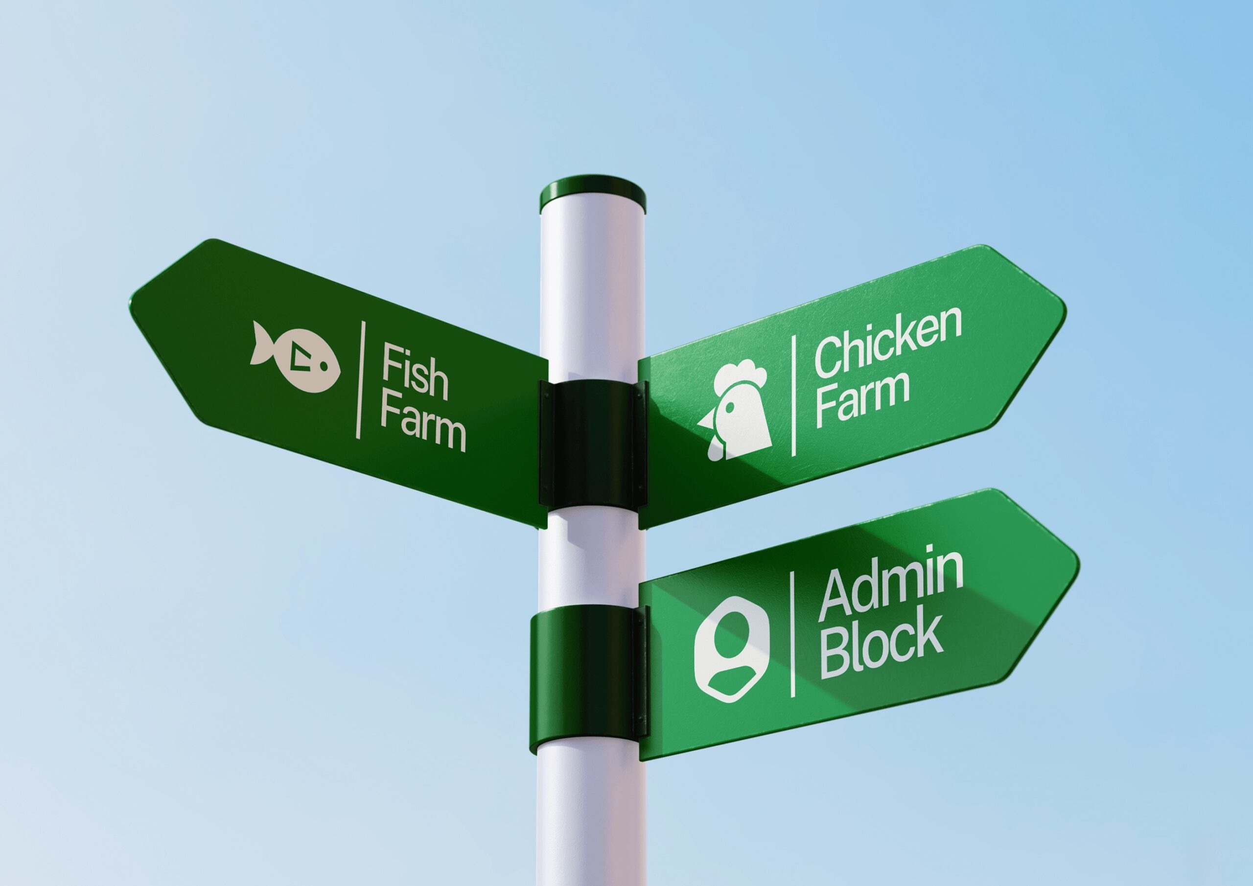
Merchandise & Environmental Branding: Applied the identity to diverse physical assets, including staff uniforms (vests and caps), vehicle wraps, and stationery.
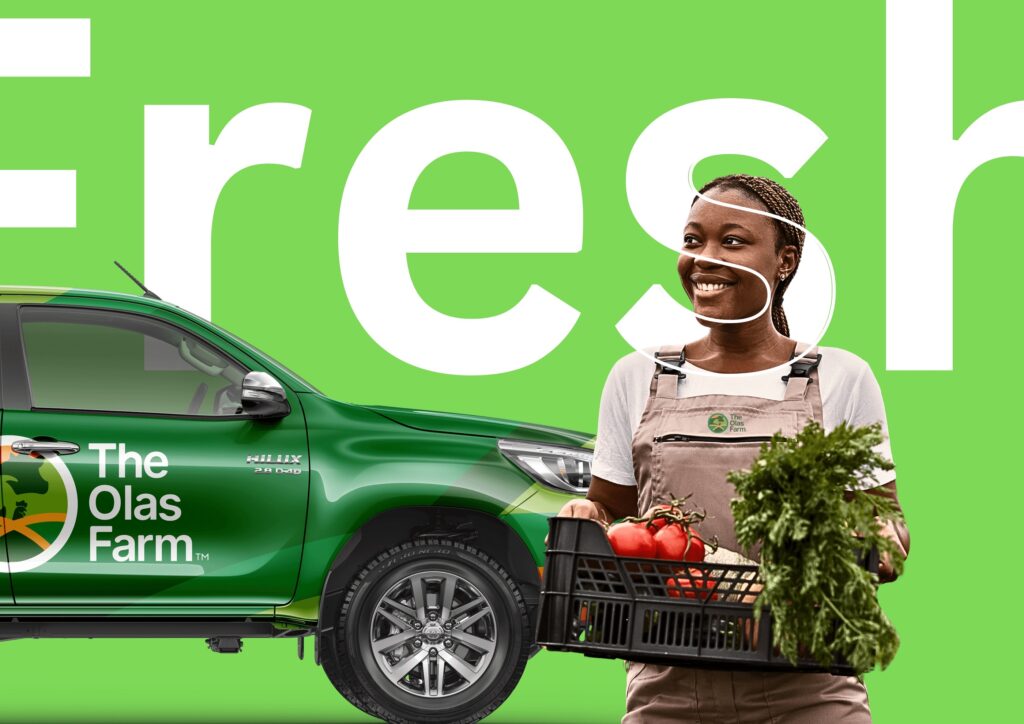
Marketing Collateral: Designed high-impact promotional graphics featuring cinematic photography to highlight the “farm-to-door” quality.